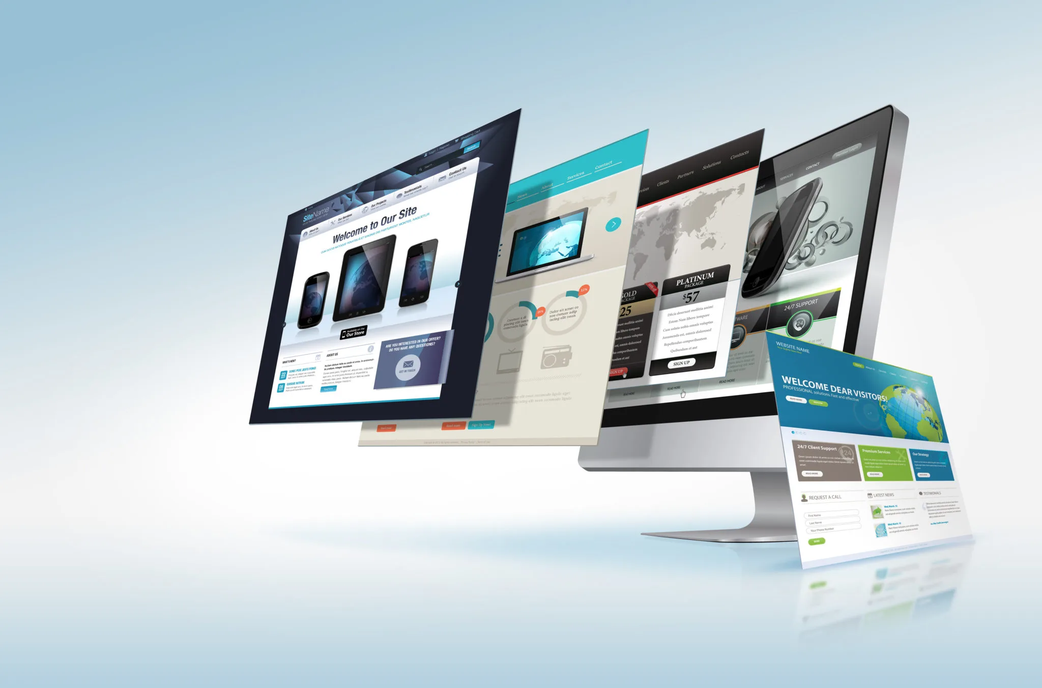
As technology continues to advance, the evolution of responsive design is undergoing a significant transformation to meet the demands of foldable device screens. These innovative devices, feature flexible displays that can be folded or unfolded to create various screen sizes and orientations, present unique challenges and opportunities for designers and developers. The traditional approach to responsive design, which primarily focused on adapting content to different screen sizes and orientations, is now evolving to address the complexities introduced by foldable technology. Foldable devices, such as smartphones with foldable screens and new-generation tablets, offer users the ability to multitask and switch between different modes of use with ease. This flexibility requires a rethinking of responsive design principles to ensure a seamless and intuitive user experience across various screen configurations. The key challenge for designers is to create interfaces that adapt fluidly to the transition between different screen states, such as when a device is folded or unfolded.

To address these challenges, designers are adopting new strategies and techniques. One approach involves utilizing advanced layout frameworks that can dynamically adjust content based on the device’s current screen configuration. For example, when a foldable device is opened to its full screen, the design might expand to utilize the additional screen real estate, providing a more immersive experience. Conversely, when the device is folded, the design must efficiently condense content without compromising usability or readability. Another important consideration is the impact of foldable screens on touch interactions. Designers must account for the varying touch areas and gestures that are possible in different modes of the device. This requires a meticulous approach to user interface design, ensuring that interactive elements are accessible and functional regardless of how the device is positioned. Additionally, foldable devices may introduce new gestures and interactions that need to be incorporated into the design, further enhancing the user experience.
Testing and optimization play a crucial role in the development process for foldable devices. Designers and developers must rigorously test their designs across multiple screen states and orientations to ensure consistency and performance. This involves using emulators and real devices to simulate different folding scenarios and identify any potential issues that may arise. By conducting thorough testing, designers can refine their approach and deliver a more polished and reliable user experience. The evolution of responsive design to accommodate foldable device screens represents a significant milestone in the ongoing quest for more adaptable and user-friendly technology. As foldable devices become increasingly prevalent, the design community must continue to innovate and adapt, embracing new challenges and opportunities. This shift not only enhances the usability and functionality of foldable devices but also paves the way for future advancements in responsive design. By staying ahead of these changes, designers can ensure that they are providing users with seamless and engaging experiences across the full spectrum of modern device capabilities.

